Leading interior designers are sounding the alarm on several once-popular living room paint colors that will be officially out of style in 2026. If you’re planning a refresh, now is the moment to ditch greige, cool grays, and even classic black and white combos to create a home that feels modern, warm, and inviting.
Industry experts including Maggie Griesbeck of MNG Design and Burcu Ercetin of Design Curations confirm these colors no longer meet today’s aesthetic demands. Griesbeck bluntly states, “Greige colors consistently fall flat for me these days,” calling the hue “dated and dingy.” She recommends using greige sparingly—only on cabinetry—while favoring bright whites like Benjamin Moore’s Simply White or Sherwin-Williams’ Greek Villa to brighten interiors.
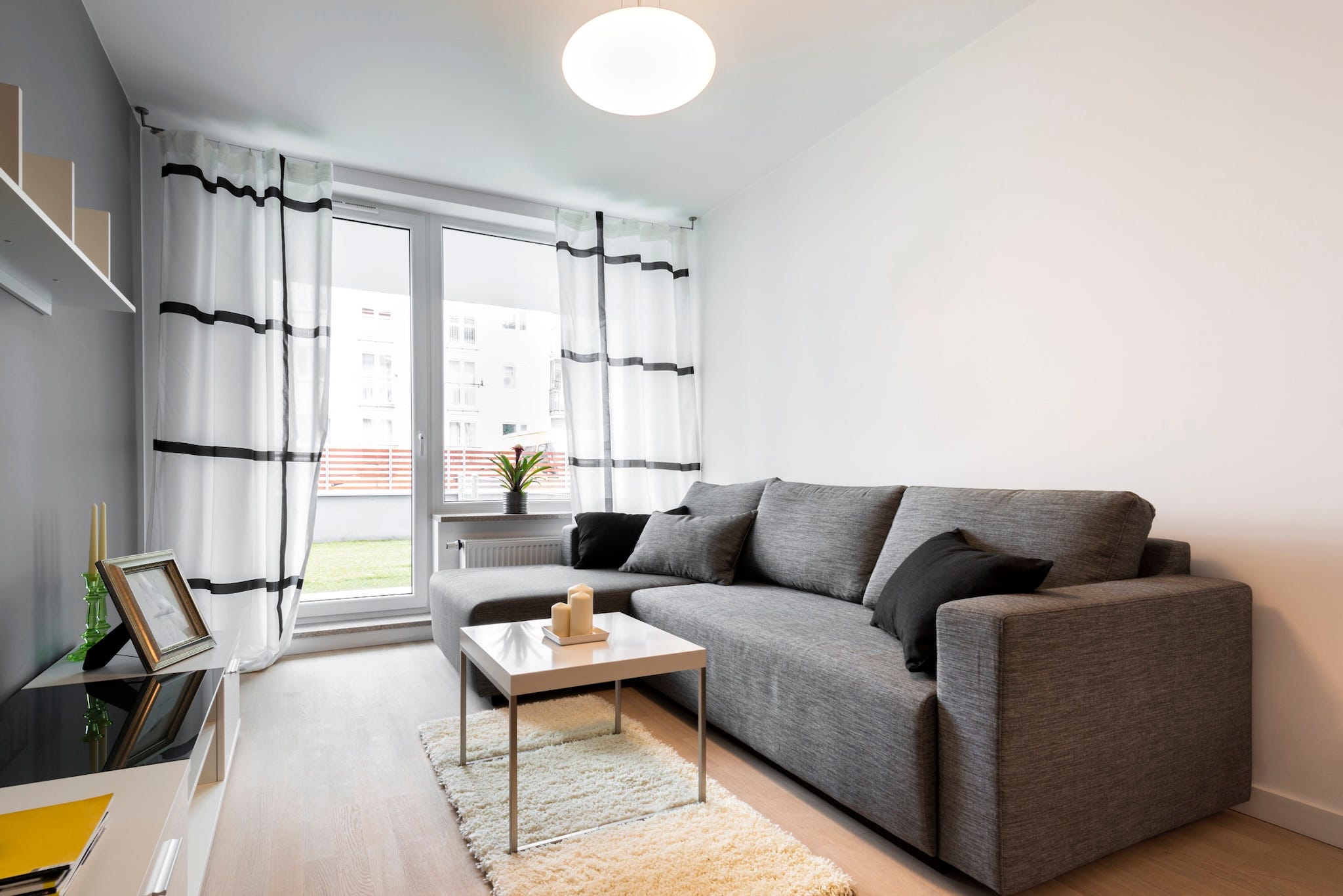
On the gray front, Burcu Ercetin warns against cool, blue-based grays that can turn a living room sterile under natural light. “It reads flat and a bit cold,” she explains, “making spaces less inviting and challenging to layer with warmth and texture.” This sentiment is echoed by designer Jennifer Pacca, who notes that “gray had its long moment but now easily dates a room.” She advocates moving toward warmer palettes that feel fresh and livable.
Beth Diana Smith, a designer based in New Jersey, firmly urges homeowners to abandon gray altogether in living rooms. “It’s been overdone for the wrong reasons, associated with cold minimalism,” she states. Instead, Smith encourages exploring vibrant, unexpected tones like green, purple, and pink or softer warm whites to reinvigorate spaces.
The rejection of cool tones doesn’t stop with gray and greige. Designer Sasha Bikoff advises against any cool white hues that lack warmth and appear commercial. “Lean into warmer, golden whites that enhance natural light and give a lived-in, cozy feel,” she insists.
Perhaps the most surprising departure is Kerrie Kelly’s call to retire black and white color schemes from living rooms. Known for their striking contrast, these combos are now deemed “too harsh” and lacking in versatility for residential comfort. Kelly points to recent trends spotted at the Milan Salone del Mobile design fair, where tonal, nature-inspired palettes are taking center stage. Warm mineral tones, soft clays, muted olives, and layered ivories provide richer depth and harmonize beautifully with natural wood, stone, and textiles.
Why this matters right now: California homeowners and designers nationwide are looking for more welcoming, timeless interiors that foster comfort and authenticity. The colors you choose today set the stage for years of living and socializing, so following these expert warnings can avoid an outdated look that hits the market later this year.
The next step for anyone redoing their living rooms in 2026 is to swap out the cold, tired shades for warmer, layered, nature-inspired palettes that enhance natural light and texture. Doing so aligns with the latest global design movements and satisfies growing desires for homes that feel both stylish and lived-in.
As paint brands continue to roll out new collections, expect to see bold greens, earthy pinks, and warm whites dominate store shelves while the era of greige, cool gray, and stark monochrome fades away. Following these design signals can increase your home’s appeal, value, and comfort in today’s competitive market.
Stay tuned to The California Herald for more updates on emerging home trends shaping living spaces across California and the United States.